February 2nd, 2026
11 Best Alternatives to Power BI and Tableau for 2026
By Zach Perkel · 35 min read

After testing dozens of alternatives to Power BI and Tableau, here are the 11 best data visualization and analytics platforms for business users in 2026.
11 best alternatives to Power BI and Tableau: At a glance
Power BI and Tableau alternatives include natural language query tools, real-time dashboard platforms, and embedded analytics solutions built for teams without technical backgrounds. Here's how the 11 best platforms compare:
Alternative | Best For | Starting price (billed annually) | Key advantage |
|---|---|---|---|
Natural language data analysis | Lets you ask questions in plain English and get charts, insights, and reports without writing code | ||
Exploring data relationships | $200/month for 10 users | Uses an associative engine that reveals hidden connections across your datasets | |
Centralized data modeling | Defines metrics once through LookML so your entire team works from the same definitions | ||
Near real-time business dashboards | Connects to hundreds of data sources and updates dashboards as new information arrives | ||
Embedding analytics into apps | Provides developer-friendly tools to build custom analytics directly into your products | ||
Search-driven insights | Combines natural language search with AI recommendations to surface trends automatically | ||
Budget-conscious teams | $48/month (Cloud) | Delivers essential BI features at a lower price point than enterprise platforms | |
Marketing and sales dashboards | $159/month with 3 data sources included | Pulls data from marketing and sales tools into pre-built dashboard templates | |
AWS-based infrastructure | $24/user/month for an Author subscription, billed monthly | Integrates seamlessly with AWS services and scales automatically based on usage | |
SQL-focused analysis | Combines SQL queries with Python and R notebooks for technical data teams | ||
Near real-time metrics tracking | Displays live KPIs from multiple sources on customizable dashboards without complex setup |
Why I looked for alternatives to Power BI and Tableau
Cost is a major factor that pushes teams away from Power BI and Tableau. Per-user licensing means you pay for every person who needs access to reports, whether they're building dashboards daily or checking numbers once a month.
Power BI requires expensive Premium plans for larger teams, while Tableau pricing increases once you move beyond a few analysts. Server costs and admin time make the bills even higher.
The technical side can create issues too. Power BI expects you to learn DAX, which is a formula language for calculations. Tableau has its own calculation system with something called level-of-detail expressions. I’ve found many business users just want to see their numbers in a chart. With Tableau and Power BI, they often have to spend weeks learning (or wait for feedback from the data team).
Another concern is performance. Power BI limits how many data points you can show in certain charts. Tableau dashboards can lag when you add filters or complex calculations. Teams end up spending time optimizing instead of analyzing.
From testing and my research, here are the problems that came up most often:
High costs: User fees and server expenses grow as more people need access
Technical learning curve: Formulas and data modeling require training that slows teams down
Performance issues: Large datasets cause slow load times or hit platform limits
Hard to manage at scale: Permissions, schedules, and dashboard libraries get messy as you grow
Workflow mismatches: Data science teams want tools that connect better with Python and cloud platforms
Isolated from other tools: Tableau works separately from your other apps, which adds extra steps
1. Julius: Best for natural language data analysis
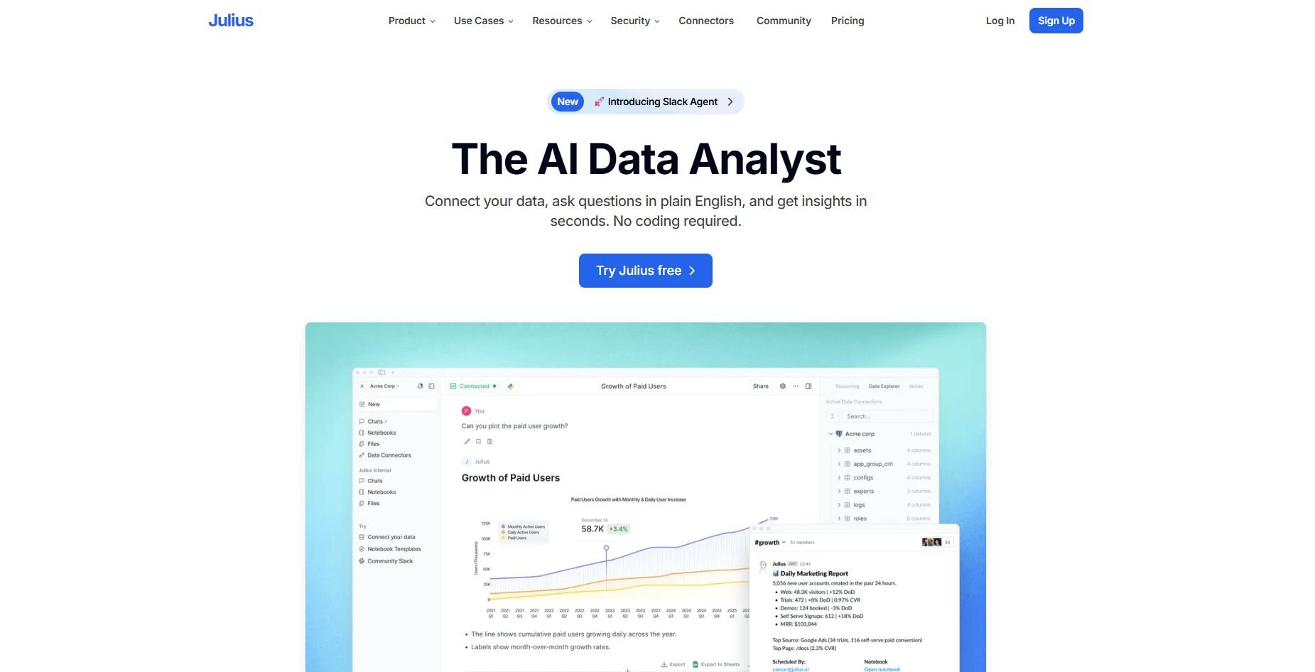
Julius is an AI-powered data analysis tool. We designed it to help you get answers from your data without writing queries or setting up notebook environments.
You connect a business data source, ask a question in natural language, and Julius returns visual outputs like charts or tables showing the metrics you need. You can see each result in a Notebook that shows the step-by-step logic, lets you schedule recurring analysis, and allows you to share results as PDFs or CSVs. You get an audit-friendly record of every query without learning SQL or Python.
Julius learns which tables connect to each other and what each column means as you work. Follow-up questions pull the correct data without requiring you to re-explain your database setup.
You can use the visual view for direct answers or open the code view when you want to see how the result was built. Both options follow the same structure, so you can switch between them without losing clarity. This gives you a fast look at the query behind it.
Tip: We also have a Power BI vs Tableau vs Julius comparison if you’d like to learn more.
Why it beats Power BI and Tableau
No setup or coding required for analysis: Ask questions the way you'd ask a colleague and get charts without configuring notebooks or learning programming languages
Context that builds over time: Julius remembers your table relationships and column meanings, so follow-up questions stay accurate without explaining your database structure again
Direct data connectors: Link to Postgres, Snowflake, BigQuery, Google Ads, Google Drive, Stripe, and Intercom without manual notebook configuration
Full audit trail for every analysis: Each result lives in a Notebook where you can review logic, adjust filters, and schedule updates when patterns change
Automated recurring reports: Schedule weekly or monthly analyses that run automatically and deliver to Slack or email without manual notebook runs
Pros
Quick chart creation from natural language questions
Easy sharing with clean visual outputs
Notebook workflow keeps analysis steps organized
Cons
Not built for deep statistical modeling or custom algorithm development
Less control over complex multi-table joins than writing SQL directly
Pricing
Julius starts at $37 per month.
Bottom line
2. Qlik Sense: Best for exploring data relationships
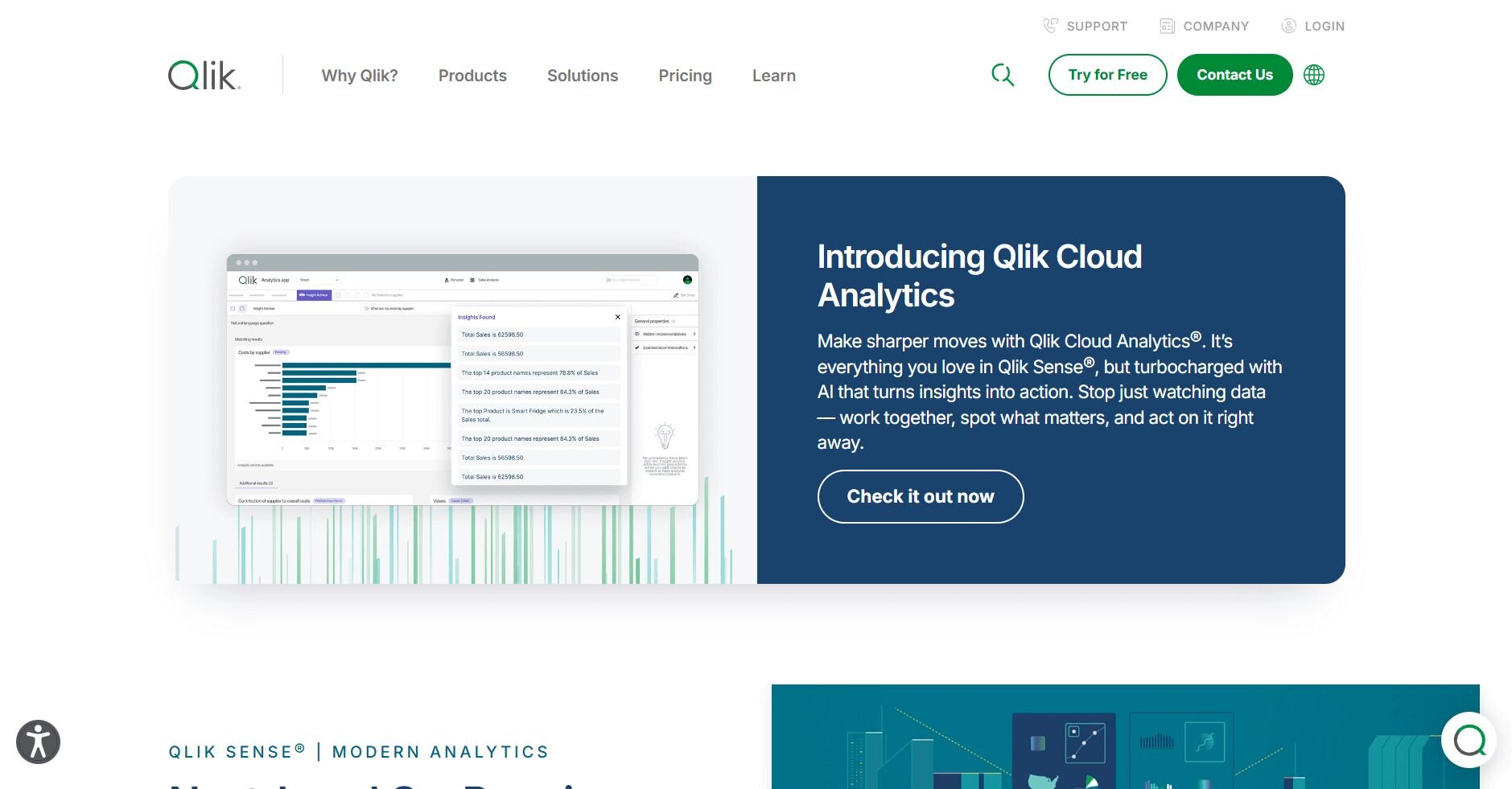
Qlik Sense is a business intelligence platform. It uses an associative engine to reveal connections in your data. You can click on any data point and see how it relates to everything else in your dataset. This way, you can explore connections without building predefined queries.
I tested this by uploading a sales dataset and selecting a specific region. Qlik automatically highlighted related products, time periods, and customer segments. This showed me patterns I hadn't thought to look for.
I also tried the dashboard builder. You drag fields to the canvas and Qlik suggests visualizations based on your data types. The charts update as you add more fields, so you can build views without planning the entire layout first.
Why it beats Power BI and Tableau
Associative exploration reveals hidden patterns: Click any data point and Qlik highlights all related information across your entire dataset without manually writing filters or creating new views
No predefined query paths required: You explore freely instead of building specific reports for each question your team might ask
Faster insight discovery during exploration: Relationships update in real time as you click through data
Pros
Reveals data relationships without technical knowledge
Handles many data sources without complex setup
Updates views as you explore
Cons
Steeper learning curve for users expecting traditional BI tools
Custom calculations require learning Qlik's expression language
Pricing
Qlik Sense starts at $200 per month for 10 users.
Bottom line
3. Looker: Best for centralized data modeling
Looker is a business intelligence platform owned by Google Cloud. It uses a modeling language called LookML to define metrics once. That way, your entire team works from the same calculations and definitions.
I set up a revenue model in LookML to test how it works. Once I defined how to calculate revenue, anyone on the team could use that metric without rebuilding the logic. This stops two people from reporting different numbers for the same metric.
I also explored how non-technical users interact with the platform. They can build reports by dragging pre-defined fields without touching LookML. The underlying logic stays consistent because everything pulls from the central model.Why it beats Power BI and Tableau
Single source of truth for metrics: Define revenue, churn, or any metric once in LookML and everyone uses the same calculation automatically
Business users work without breaking definitions: Teams build reports from pre-defined fields instead of recreating formulas that might introduce errors
Easier governance at scale: Changes to metric definitions update across all reports instead of requiring manual fixes in dozens of dashboards
Pros
Prevents metric inconsistencies across teams
Non-technical users can build reports safely
Strong integration with Google Cloud services
Cons
Requires technical knowledge to set up LookML models initially
Less visual customization than design-focused platforms
Pricing
Bottom line
4. Domo: Best for near real-time business dashboards
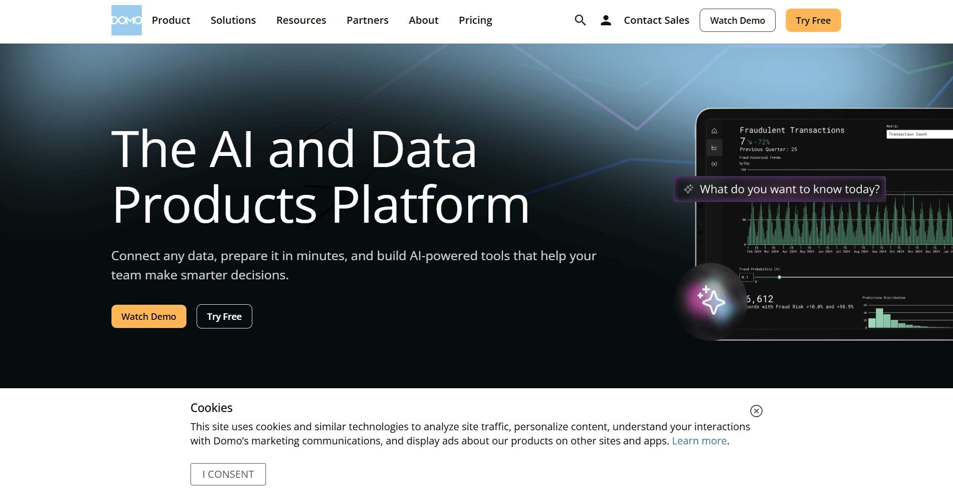
Domo is a cloud-based business intelligence platform that connects to hundreds of data sources. You can pull information from sales tools, marketing platforms, and databases into one dashboard. This dashboard updates as new data arrives.
I connected Domo to a few data sources to see how quickly dashboards refresh. The platform pulled data from Google Analytics and a SQL database without requiring manual exports. Updates appeared within a few minutes of new data landing in the source systems.
I also tested the dashboard builder. You select a data source, choose your metrics, and drag them onto a canvas. Domo offers pre-built templates for common use cases like marketing performance or sales pipelines. You can start with a working layout instead of building from scratch.
Why it beats Power BI and Tableau
Hundreds of pre-built connectors: Link to tools like Salesforce, HubSpot, and Google Ads without building custom integrations or writing API calls
Dashboards update automatically: New data flows in without manual refresh schedules or waiting for overnight batch jobs
Mobile-first design: Access full dashboards from your phone without losing functionality or readability
Pros
Connects to many data sources with minimal technical setup
Dashboards update automatically as new data arrives
Strong mobile app for viewing reports on the go
Cons
Can get expensive as you add more users
Advanced features require technical knowledge
Pricing
Domo uses custom pricing based on your organization's needs.
Bottom line
5. Sisense: Best for embedding analytics into apps
Sisense is a business intelligence platform built for companies that want to add analytics directly into their own products. You can use its APIs and SDKs to embed dashboards, charts, and reports inside your application. This allows customers to see their data without leaving your interface.
I tested the embedding features by creating a dashboard and testing the iframe integration. Sisense provides code snippets that let developers embed analytics into their app quickly. The embedded views matched my branding with minimal custom CSS.
I also checked how it handles data from multiple sources. Sisense can pull from databases, APIs, and files into a single view. The platform processes the data so your embedded analytics are fast even when pulling from different systems.
Why it beats Power BI and Tableau
Built for white-label embedding: Customize dashboards to match your product's look without visible Sisense branding
Developer-friendly APIs: Embed specific charts or full dashboards using straightforward code snippets instead of complex integration work
Handles data from multiple sources: Combine information from your database, third-party APIs, and uploaded files into one embedded view
Pros
Strong tools for embedding analytics into products
Handles large datasets without performance drops
Flexible deployment options, including cloud and on-premises
Cons
Requires technical knowledge to set up and customize
Higher price point than simpler BI tools
Pricing
Sisense uses custom pricing based on your requirements.
Bottom line
6. ThoughtSpot: Best for search-driven insights
ThoughtSpot is a business intelligence platform that uses search and AI to help you find insights. You type questions into a search bar like you would in Google, and ThoughtSpot returns charts and tables based on your data.
I typed questions about sales trends and customer behavior to see how the search worked. AI agents work behind the scenes to understand your question, find the right data, and build visualizations. They also suggest follow-up questions based on what you searched for, which helped me discover patterns I hadn't thought to explore.
I checked the setup process next. You connect your data sources and ThoughtSpot indexes them so search works quickly. The platform improves search relevance over time by recognizing common terms, synonyms, and usage patterns across your data.
Why it beats Power BI and Tableau
Search bar replaces complex interfaces: Type questions in plain language instead of navigating menus or learning dashboard builders
AI suggests follow-up questions: The platform recommends related analyses based on what you searched, helping you discover insights you didn't think to look for
Improves search relevance over time: Search results improve as more people query your data because the system learns common terms and patterns
Pros
Easy for non-technical users to get started
AI recommendations surface unexpected insights
Search results return quickly, even with large datasets
Cons
Requires time to index data before search works well
Advanced customization options are limited compared to traditional BI tools
Pricing
ThoughtSpot starts at $25 per user per month.
Bottom line
7. Zoho Analytics: Best for budget-conscious teams
Zoho Analytics is a business intelligence platform that delivers core BI features at a lower price than enterprise tools. You can connect data sources, build reports, and create dashboards without the high per-user costs of larger platforms.
I started by connecting a spreadsheet and a database to see how the tool handles different sources. Zoho processed both and let me combine them into one report. The drag-and-drop interface made it easy to build charts without technical knowledge.
I also tested the AI assistant feature. You can ask questions about your data in plain English and Zoho generates visualizations based on your question. The AI Assistant works well for simple queries but struggles with complex joins or advanced multi-table analysis.Why it beats Power BI and Tableau
Lower cost per user: Get essential BI features without paying premium prices as your team grows
Quick setup for small teams: Connect data and start building reports quickly without heavy configuration
Integrates with other Zoho products: Pull data from Zoho CRM, Books, and other apps without building custom connections
Pros
Affordable pricing for small to medium teams
Easy to learn for non-technical users
Good integration with Zoho's business app suite
Cons
Limited advanced analytics features compared to enterprise platforms
Performance can slow with very large datasets
Pricing
Zoho Analytics starts at $48 per month for the Cloud plan.
Bottom line
Zoho Analytics works well when budget is a primary concern and you need basic BI features without enterprise complexity. If you need embedded analytics for your product, Sisense may be a better choice.
8. Databox: Best for marketing and sales dashboards
Databox is a dashboard platform built primarily for marketing and sales teams. It pulls data from tools like Google Analytics, HubSpot, and Facebook Ads into pre-built dashboard templates that track common metrics.
I connected Databox to a few marketing platforms to test how quickly I could get dashboards running. The pre-built templates came with metrics already configured, so I didn't need to figure out which numbers to track. I just selected the template and connected my accounts.
I also checked the mobile app. Databox sends daily or weekly snapshots of your key metrics to your phone. This worked well for quick check-ins without opening a laptop to review full dashboards.Why it beats Power BI and Tableau
Pre-built templates for common use cases: Start tracking marketing ROI or sales pipeline metrics immediately instead of building dashboards from scratch
Built for marketing and sales tools: Connects directly to platforms like Google Ads, Salesforce, and Mailchimp without custom integration work
Mobile snapshots delivered on schedule: Receive metric summaries on your phone daily or weekly instead of logging into a web dashboard
Pros
Fast setup with pre-configured dashboards
Strong focus on marketing and sales metrics
Mobile app provides quick metric snapshots
Cons
Limited customization compared to flexible BI platforms
Best suited for marketing and sales teams rather than general analytics
Pricing
Databox starts at $159 per month with 3 data sources included.
Bottom line
9. Amazon QuickSight: Best for AWS-based infrastructure
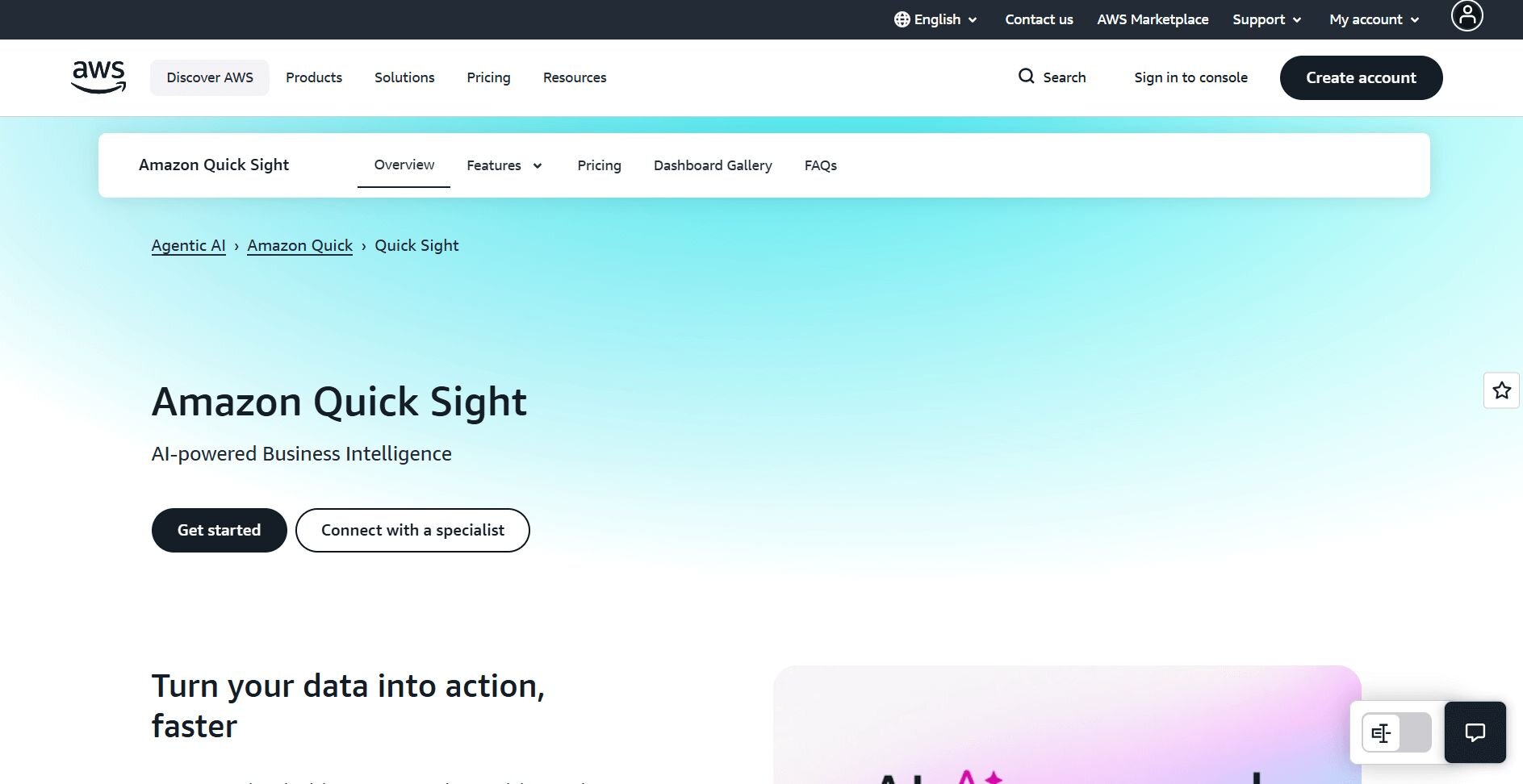
Amazon QuickSight is a business intelligence service built by Amazon Web Services (AWS). It connects directly to AWS data sources like S3, Redshift, and RDS. It also scales automatically based on how many people use it.
I tested QuickSight by connecting it to an S3 bucket with sales data. The setup was straightforward because it recognized my AWS credentials automatically. Building dashboards involved selecting fields and choosing chart types from a menu.
I also looked at the pricing model. QuickSight offers session-based pricing for Readers, so you only pay when someone actually views a report. Authors use a monthly subscription. This can save money if you have users who check dashboards occasionally rather than daily.Why it beats Power BI and Tableau
Native AWS integration: Connect to S3, Redshift, and other AWS services without setting up separate data pipelines or authentication
Pay-per-session pricing: Only pay when users actually open dashboards instead of flat monthly fees for inactive accounts
Scales automatically: Handle traffic spikes without managing servers or provisioning capacity
Pros
Easy setup if you already use AWS services
Cost-effective for occasional users
Handles large datasets efficiently within AWS
Cons
Limited visualization options compared to design-focused platforms
Best suited for AWS users rather than general BI needs
Pricing
Amazon QuickSight starts at $24 per user per month for an Author subscription, billed monthly.
Bottom line
10. Mode: Best for SQL-focused analysis
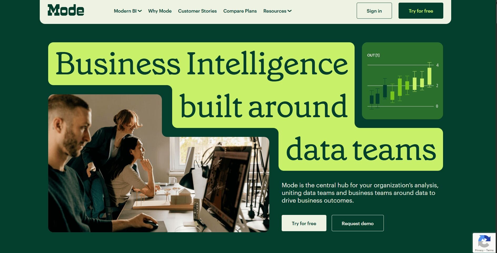
Mode is an analytics platform built for technical teams who write SQL queries. You can write SQL queries and then analyze the results using Python or R notebooks in the same workspace. That way, you don't need to export data to other tools for statistical analysis.
I wrote a few SQL queries to pull sales data using Mode. I liked that the built-in SQL editor includes autocomplete and syntax highlighting. Results also appeared in tables that I could then visualize using Mode's chart builder.
I also tested the notebook feature. You can write Python code to get data from your SQL queries. Then, you can run a statistical analysis on that data. This worked well for tasks like correlation checks and short-term trend projections.
Why it beats Power BI and Tableau
SQL editor built for analysts: Write complex queries with autocomplete and syntax highlighting instead of using visual query builders
Python and R notebook integration: Run statistical analysis on query results without exporting data to separate tools
Query version history: Track changes to SQL code and revert to earlier versions when needed
Pros
Strong tools for SQL-focused workflows
Combines queries with Python and R analysis
Good collaboration features for technical teams
Cons
Not suitable for non-technical users
Requires SQL knowledge to get value from the platform
Pricing
Mode uses custom pricing based on team size and needs.
Bottom line
11. Klipfolio: Best for near real-time metrics tracking
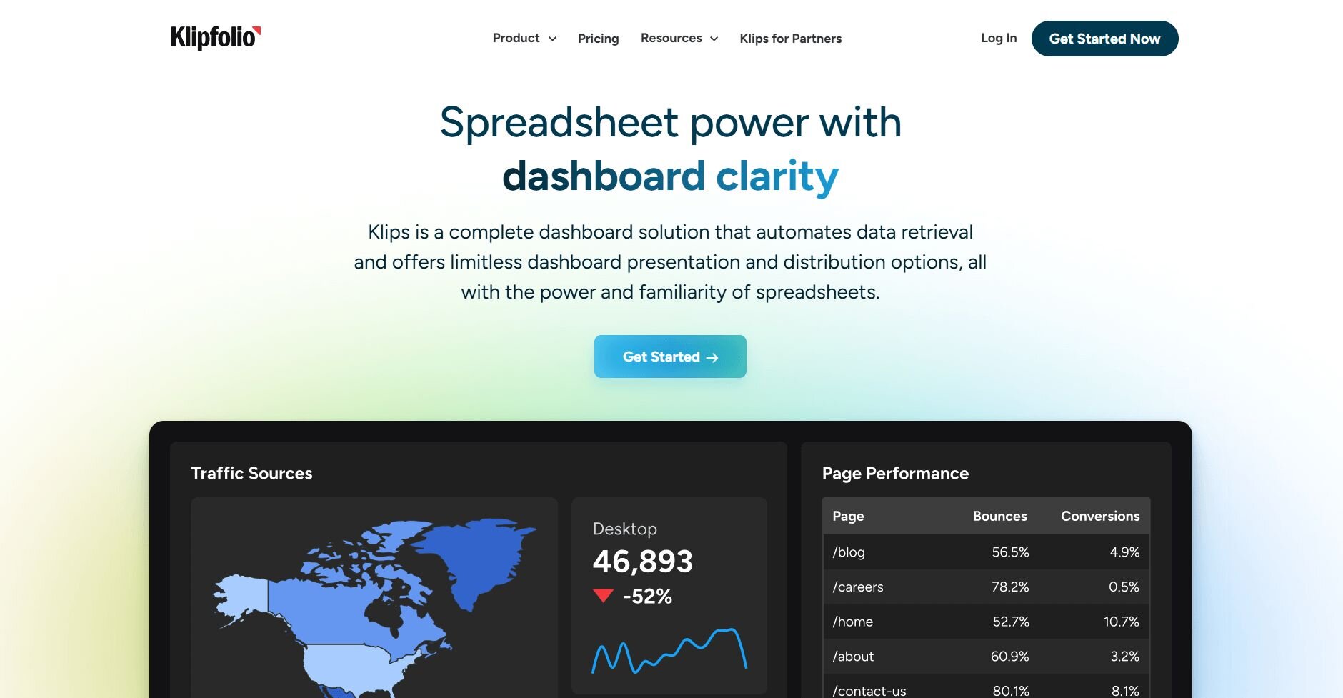
Klipfolio is a dashboard platform that displays KPIs from multiple sources. It allows you to link data sources and create dashboards that update in near real time.
I set up a dashboard in Klipfolio by connecting a few APIs and a database. The platform pulled data and let me arrange metrics on a canvas using pre-built widgets. New data appeared shortly after it was pulled from the source systems without me needing to reload the page.
I also tested the mobile view. Dashboards adapt to phone screens so you can check metrics while away from your desk. The interface stays readable even with multiple charts on one screen.
Why it beats Power BI and Tableau
Near real-time updates: Metrics refresh automatically at short intervals without waiting for long scheduled refresh windows
Pre-built widgets for common metrics: Drop KPI cards and charts onto dashboards without building visualizations from scratch
Fast setup for KPI monitoring: Get dashboards running quickly without extensive data modeling or transformation work
Pros
Simple setup for real-time monitoring
Pre-built widgets speed up dashboard creation
Mobile-friendly interface for checking metrics anywhere
Cons
Limited advanced analytics features
Customization options are more restricted than flexible BI platforms
Pricing
Klipfolio starts at $120 per month.
Bottom line
How I tested these alternatives to Power BI and Tableau
I wanted to see how these tools work when you need answers fast. I used each platform the way marketing teams, finance departments, and operations managers would. So I connected data, built dashboards, and tracked how long it took to go from "we need this report" to actually having it ready.
Here's what I checked:
Connecting data from different sources: I linked spreadsheets, databases, and tools like Google Analytics to see which platforms made this simple and which ones needed technical work.
Building dashboards without templates: I started with blank screens to see what new users face. Then I tried pre-built templates to check if they actually save time.
Asking questions in plain English: For tools that say you can type what you want, I tested if they understand normal business questions or if you need to learn special phrasing.
Testing with larger datasets: I used files with thousands of rows and real databases to see which tools slow down and which ones stay fast.
Checking mobile access: I opened dashboards on my phone to see if they work well or if you need a computer.
Comparing costs: I figured out what it costs to add 10 users, then 50, then 200 to see which platforms stay affordable as teams grow.
How to choose the right alternative to Power BI and Tableau
Some alternatives focus on technical workflows with SQL and notebooks. Others remove code completely for drag-and-drop dashboards. Choose:
Julius if you want to ask questions in natural language and get charts without writing SQL or building data models
Qlik Sense if you need to explore how different parts of your data connect without building specific queries first
Looker if you want one team to define metrics in code so everyone else uses the same calculations automatically
Domo if you need dashboards that pull from many different tools and update as new data arrives
Sisense if you're building analytics into your own product and need white-label embedding with APIs
ThoughtSpot if your team prefers typing search queries instead of learning dashboard builders
Zoho Analytics if your budget is tight and you need basic BI features without paying enterprise prices
Databox if you only need marketing and sales dashboards with pre-built templates for common metrics
Amazon QuickSight if your data lives in AWS and you want to avoid moving it to other platforms
Mode if your analysts write SQL daily and need Python or R notebooks in the same workspace
Klipfolio if you want live KPI monitoring across multiple sources without complex data modeling
Want data insights without code? Try Julius
Power BI and Tableau alternatives promise simple analytics, but many still require technical setup or expensive per-user licenses. Julius removes those barriers by letting you ask questions and get charts, reports, and insights without writing code or configuring complex data models.
Here’s how Julius helps:
Quick single-metric checks: Ask for an average, spread, or distribution, and Julius shows you the numbers with an easy-to-read chart.
Built-in visualization: Get histograms, box plots, and bar charts on the spot instead of jumping into another tool to build them.
Catch outliers early: Julius highlights suspicious values and metrics that throw off your results, so you can make confident business decisions based on clean and trustworthy data.
Recurring summaries: Schedule analyses like weekly revenue or delivery time at the 95th percentile and receive them automatically by email or Slack.
Smarter over time with the Learning Sub Agent: Julius's Learning Sub Agent automatically learns your database structure, table relationships, and column meanings as you use it. With each query on connected data, it gets better at finding the right information and delivering faster, more accurate answers without manual configuration.
One-click sharing: Turn a thread of analysis into a PDF report you can pass along without extra formatting.
Direct connections: Link your databases and files so results come from live data, not stale spreadsheets.
Ready to see how Julius can help your team make better decisions? Try Julius for free today.
Frequently asked questions
Which alternatives work best for teams that don't know SQL?
Can small businesses use these analytics tools without a data team?
Do these alternatives work with Excel and Google Sheets data?
Yes, most alternatives connect to Excel and Google Sheets files directly. You upload your spreadsheet or link to it, and the platform pulls the data for analysis. Tools like Julius and Qlik Sense can combine spreadsheet data with databases in the same dashboard, while Looker typically relies on modeled warehouse data.
